LifeOnScreen user dashboard
- Apr 30, 2018
- 1 min read

Additionally to the app, I was also the choice for coming up with the user dashboard for the LifeOnScreen website.
As usually with this kind of task, I start with gathering a list of functionalities that should be included; when you go over the list and try to define it as much as possible (that makes designing the interface sooo much easier).
In this case, it was a long list. But I'm up for a challenge :)
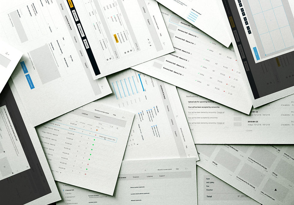
So yes, we made all the mockups. Turned them around a bunch of times, made interactive prototypes from them (this time using UXPin, as I also drew them in the same tool). Tested the poop out of them.
Then we had a meeting with the developers to see if there were any issues - and surprisingly, there were none to speak of.
Due to a time challenge, we decided to cut down on some of the functionalities to be released in a later version. Once we had a list of the priorities for the first version, we went to the design desks.
This time I didn't design the visuals myself, but I had the overview of it - and let my colleague do his magic with the pixels.
In sync with the general look of the brand, we decided upon simplicity and cleanliness.
I think it turned out pretty good, here's a few examples:


The concept was way more thought out, slick and shiny than what's online now, hopefully in the future you'll be able see it too!


Comments