Grow + Scale
- Jun 11, 2019
- 2 min read

A friend of mine, Dejan Gajšek, is a dope growth hacker and has wanted to set up a website that focuses on content marketing strategy that gets you the right traffic and the right leads.
He had the name - Grow and scale, but no brand identity yet. Well, what has two thumbs and is awesome at such stuff? 👍this girl 😬
The brief was kinda scarce, but I know D and what he likes (ta-da-tsss). He wanted a clean but recognizable, solid and professional look of the brand. But he has a tendency for double meanings.
I thought about the core of the name and their services a lot. And here my personal connection with Dejan paid off: I know he's also cuckoo about nature, hiking and the Pacific Northwest.
I came up with this:

The symbols
The little arrows upwards represent growth in the marketing sense, but also in the natural sense.

Variations
I made sure the logo was as usable as possible; with the clean lines and boxy feel it is well equipped for modularity.
The mark and the wordmark can be combined in any way and it will still be very recognizably the same logo.


I always start with a pure black/white combination, without any colours. That way I can be sure the logo will work in one colour - it doesn't rely on any additional hue to be well executed.
But, of course, it works also in colours:


Font and colours
The font is geometric, bold but remains clean; I used Neutra Display Titling and it does the job marvellously.
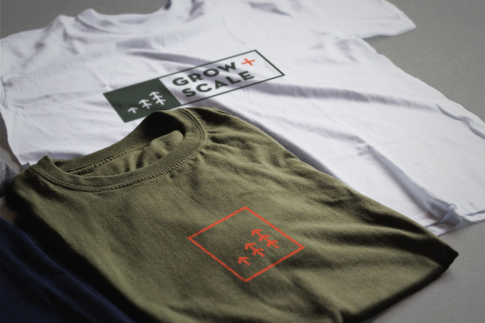
The colour palette is very specific as well; Dejan is keen on the olive, so naturally that was part of the brand as it also matches the tree / growth connection well.
Additionally, I combined it with a very specific colour: a colour I read about just weeks before the project - the "unignorable". Pantone describes as "...it radiates pure energy, is instantly captivating and cannot be ignored" and "...calls out for attention while remaining friendly, approachable and optimistic".
It was a perfect match for marketing purposes; CTAs, profile pictures, favicons, basically anything that needs attention would be more than appropriate.

And me being me, I can't not add the logo to various applications.


Dejan was (and hopefully still is) stoked about the identity and till this day it was one of my favourite things to work on - loved how it turned out!


Comments