Logos galore!
- Apr 18, 2017
- 2 min read
In my 13+ years as a designer I've created my share of identities and logos - actually, it's one of my favourite things to design.
Why? Because it's not only about the pretty looks or the latest trends. I always want to create:
an appropriate logo
has a meaning for the client
it needs to be recognizable
reflects the client's area of expertise
basically, it needs to make sense 🙂
And they need to be useful when applied and - of course - pleasing to the eye.
A bunch of them I did at my time at Tovarna idej, some of them I did by myself. But here's the gist of it:
Rogljiček
A delicious-smelling bakery needed a rebrand and I've created a concept to reflect the tradition as well as a modern take on it - sadly it's never been used.


Herald
There was an idea to make a chatbot app for customized news. So we created Herald - the persona behind it. A combo of a chatty hip guy and a speech bubble 😊 But as a few of the designs, it's never seen the light of day - at least not in this design.

MDOS
We created an identity for The Network for Social Responsibility of Slovenia (in slovene Mreža za družbeno odgovornost Slovenije) that would represent growth and accountability - in a kind of cell that connects all the parts of a metaphorical Slovenia. It ended up being used (and is still used, I believe) in a bunch of documents and I'm still proud of that.

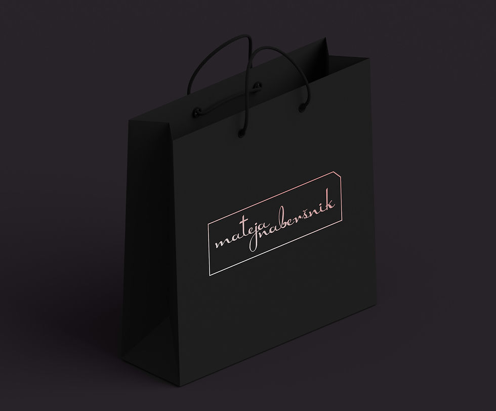
Mateja Naberšnik
A dear friend of mine is an awesome makeup artist and was in need of a logo that would represent her mastery. A little personal, a bunch professional we went with a script typography and clean lines around it - on the surface it represents a makeup box about to be opened (that little notch just wants to be interacted with)
Student council of the University of Primorska
A little mark we did for the Student council of the University of Primorska (Študentski svet Univerze na Primorskem) - a shield that protects students from various sides. The blue tones also associated with the coastal part of Slovenia.


Comments